In May of 2015, I wrote about the relationship between Labor Share and Unemployment. The post basically said that lower labor share translated into a higher limit upon unemployment.
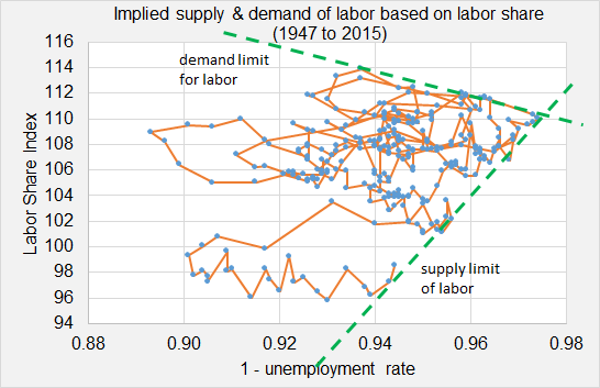
Here is the original graph from that post…

In the post, I wrote…
“The graph implies that as labor share falls, labor is less inclined to supply their labor… and the natural rate of unemployment rises.
“Since 1947, the unemployment rate falls to a level consistent with implied supply & demand limits set by labor share of national income. The US is now hitting the implied supply limit.
- Will the unemployment rate only fall as long as labor share keeps trending up?
- Will the plot line end up respecting the implied supply limit of labor?”
So what has happened since this graph was posted? Has the plot line broken through the limit that I estimated? or Has the plot line respected the limit?
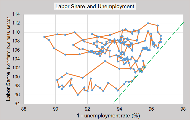
Here is the updated graph… (quarterly data)

The plot line has respected the estimated limit. (Currently labor share at 100 and 4th quarter 2015 unemployment at 5%.)


Leave A Comment