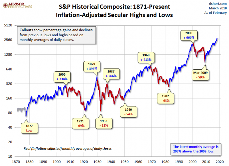
Was the March 2009 low the end of a secular bear market and the beginning of a secular bull? At this point, nine years later, the S&P 500 has set a series of inflation-adjusted record highs based on monthly averages of daily closes.
Let’s examine the past to broaden our understanding of the range of historical trends in market performance. An obvious feature of this inflation-adjusted series is the pattern of long-term alternations between uptrends and downtrends. Market historians call these “secular” bull and bear markets from the Latin word saeculum “long period of time” (in contrast to aeternus “eternal” — the type of bull market we fantasize about).

The key word on the chart above is secular. The implicit rule we’re following is that blue shows secular trends that lead to new all-time real highs. Periods in between are secular bear markets, regardless of their cyclical rallies. For example, the rally from 1932 to 1937, despite its strength, remains a cycle in a secular bear market. At its peak in 1937, the index was 29% below the real all-time high of 1929. For a scholarly study of secular bear markets, which highlights the same key turning points, see Russell Napier’s Anatomy of the Bear: Lessons from Wall Street’s Four Great Bottoms.
An alternate view of secular trends is offered by Ed Easterling of Crestmont Research. See his fascinating study Understanding Secular Stock Market Cycles, which makes a persuasive case that we remain in a bear market that began in 2000. The underlying principle, in Easterling’s view, is the price/earnings ratio, which remains lofty.
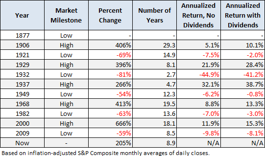
If we study the data underlying the chart, we can extract a number of interesting facts about these secular patterns (note that the table below includes the 1932-1937 rally):

Since that first trough in 1877 to the March 2009 low:


Leave A Comment