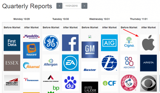
Of all the hundreds of companies reporting this week, there is one that stands head and shoulders (so to speak) above all others, and it is this:

I am deliberating post these charts before the closing bell. Of course, unlike some companies, Apple takes its sweet time to issue its report after the close. Most companies have their earnings out within milliseconds of the closing bell, but Apple, prima donna style, waits half an hour or more. Needless to say, it’s a very big deal.
Let me be clear on two things: (1) I have absolutely no position in AAPL; in fact, I never touch the stuff (2) I have no particularly strong opinion about its direction. My dumb guess is that it actually turns out to be a boring, relatively positive, stock-goes-up-some-more type event. Of course, what I’d LOVE to see is a drop – ANY drop! – since Apple tends not to disappoint the public.
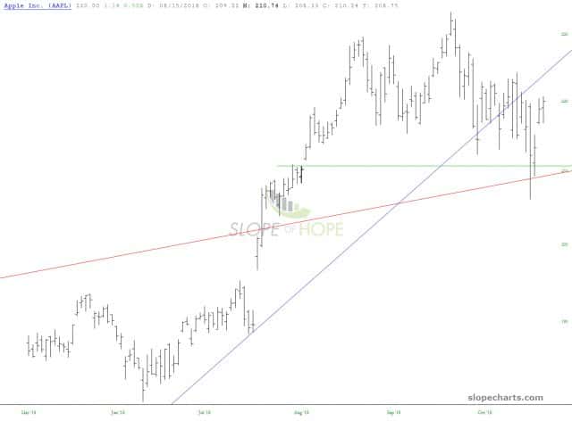
Looking closely at the stock, there’s no particularly clear pattern. One could argue that this is a tiny top, but honestly, it’s nothing to write home about. It would need to drop below 206 – a near impossibility! – – to really get hellfire going.

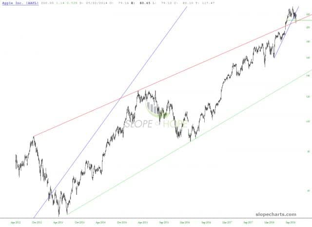
The longer-term chart shows Apple is really, really, really high… priced for perfection. With a P/E of 19, it’s relatively sensibly priced in this market – nothing like NFLX, which still has a P/E in the triple digits. But she’s mighty lofty.

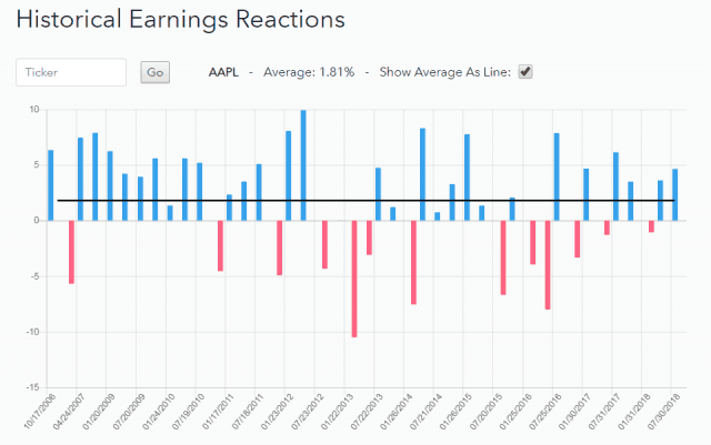
The page on Slope for Historical Earnings Reactions shows that the reaction tends to be positive, and in recent times, even disappointing drops have been minuscule. With a company this large and this widely-followed, it seems expectations and measurements tend to align with reality.

The page for Price Change shows the gyrations of AAPL for dozens of different prior quarters leading up to the quarterly earnings. On average (black line), there does seem to be a modest dip following earnings, but remember, this is over the course of many years and includes some big drops.


Leave A Comment