‘Everything Is Not Rolling Over’
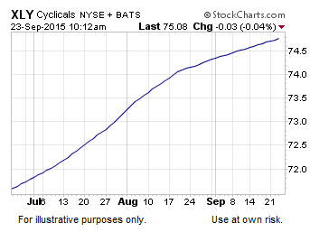
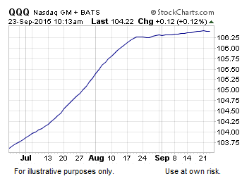
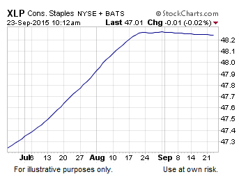
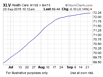
You may have heard the argument that the stock market looks better than many believe, based on the fact that several key sectors have not rolled over yet. For example, while the slope of the S&P 500’s 200-day moving average is clearly negative, using the same gauge several market sectors look a bit better. The charts below show the 200-day moving averages for healthcare (XLV), consumer discretionary (XLY), technology (QQQ), and consumer staples (XLP).

Adding Price Into Equation
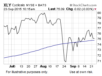
While the 200-days in isolation shown above look better than the S&P 500’s 200-day, if we add price back into the mix, things start to look more concerning. Consumer discretionary stocks have managed to reclaim their 200-day, which is a positive development. However, the 200-day remains very close by and the slope of the 200-day shows a very indecisive long-term trend (read vulnerable).
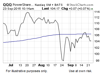
Tech stocks rallied back to their 200-day and thus far have failed to recapture the “long-term trend” demarcation line. It is not uncommon for markets to rally back to their 200-day during a correction or bear market, and then fail. Bulls want QQQ to recapture and hold above the 200-day, which may happen, but it has not yet.
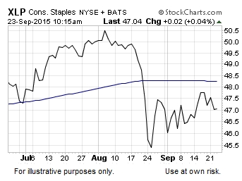
Consumer staples have a similar “bounce” look. Price is below a downward-sloping (bearish) 200-day moving average. Can it improve in the coming days? Sure it can, but we need to see it.
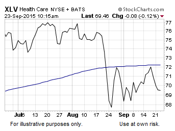
The song remains the same with healthcare. A sharp plunge below the 200-day followed by a bounce back to the 200-day. The chart below in its present form is not an encouraging look for stock market bulls.
How Do The “Leaders” Look From A Weekly Perspective?
Regular followers know we use a set of weekly moving averages to monitor the general state of trends. How do the S&P 500’s strongest sectors look from this perspective? The answer is not good.



Leave A Comment