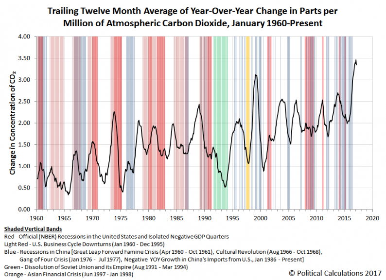
It has been just over a year since we last featured an update to our chart that correlates the change in atmospheric carbon dioxide with the relative health of the Earth’s economy.
We haven’t been holding back because we didn’t want to share what we were seeing – we were holding back because large El Niño-related wildfires in Indonesia in 2015 flooded the Earth’s atmosphere with extra carbon dioxide, which meant that we couldn’t tell the difference between the additional contribution of CO2 from wildfires from that contributed by productive human activities.
But we’re now coming up on when that extra CO2 will have fully dissipated from the atmosphere, leaving it clean enough to more clearly communicate how the global economy is faring. Speaking of which, here is what we see today when we measure the trailing twelve month average of year-over-year change in the parts per million of atmospheric carbon dioxide as measured at the Mauna Loa Observatory.

In this chart, we’ve begun to see the trailing year average in the rate at which the amount of carbon dioxide in the Earth’s air is changing begin to decline, which will become more dramatic over the next several months once we get past the one-year anniversary of when the contribution of 2015’s Indonesia wildfires to atmospheric CO2 measured at Mauna Loa peaked in May 2016.
The next chart looks at the raw year-over-year change in atmospheric CO2, where we can confirm that those levels have dropped to levels that are consistent with the upper end of the range where they’ve been through much of the current century. [Note: The spike in the recorded data for January 2017 appears to be something of an anomaly.]

We think that is in part because the economies of both China and the U.S. have begun growing more strongly than they were a year ago, where China’s economy in particular appears to be growing much faster.


Leave A Comment