Tuesday’s JOLTS report once again confirmed the very good employment report from one month ago:
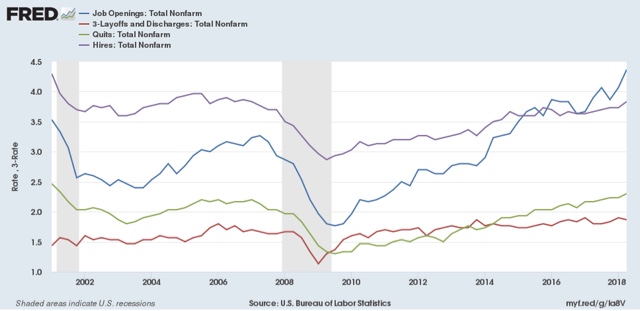
Let’s update where the report might tell us we are in the cycle, remaining mindful of the fact that we only have 18 years of data. To do that, I am varying my past presentations to focus instead on hiring, quits, layoffs, and openings as a percentage of the labor force. Here’s what they look like since the inception of the series (layoffs and discharges are inverted at the 1.5% level, so that higher readings show fewer layoffs than normal, and lower readings show more:

Note the data is averaged quarterly to cut down on noise.
During the last expansion:
By contrast during and after the last recession:
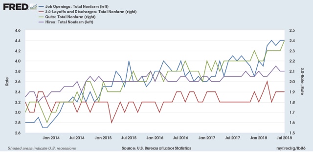
Here’s what the four metrics look like on a monthly basis for the last five years (note: Quits and Layoffs and Discharges scaled on right):

While only Quits made a new expansion high, the trend in quits and Openings has been very positive, while that of actual Hirs and Layoffs has been more mutedly so.
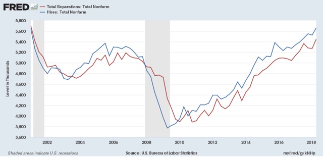
Next, here’s an update to the simple metric of “hiring leads firing,” (actually, “total separations”). Here’s the long term relationship since 2000, quarterly:


Leave A Comment