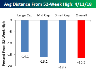
While the S&P 500 as a whole is down nearly 8% from its recent 52-week high in late January, as you might expect, the average decline of individual stocks in the index is quite a bit larger. The first chart below shows the average distance between the current price of stocks in the S&P 1500 relative to their 52-week highs by market cap. Overall, the average stock in the S&P 1500 is down just over 16.5% from its 52-week high. From a market cap perspective, the trend is pretty typical of what you would expect to see. Small caps are currently trading the furthest from their 52-week highs (-18.7%), mid caps are right in the middle (-16.2%), while large cap stocks are down an average of 14.1%.

The chart below shows the average distance that stocks in the S&P 1500 are trading relative to their 52-week highs by sector. Currently, there are just two sectors where the average percentage decline is greater than 20% (Energy and Telecom Services). In the case of Energy, the current 21.1% reading is actually pretty good compared to prior readings we have seen for the sector over the last couple of years. Meanwhile, the Telecom Services sector only has a handful of stocks in it, so we don’t really place much focus on that. Financials are one sector that has held up really well in the recent market turbulence as stocks in that sector are only down an average of 11.9%.Since it’s the largest sector, no discussion would be complete without mentioning Technology, and while it had been a market leader, stocks in the sector are actually now down slightly more relative to their 52-week highs (-16.7%) than the overall market (-16.5%).

The last breakdown we wanted to look at is the average decline of stocks based on market cap and sector. The category that is down the most is small cap stocks in the Telecom Services sector (-29.66%). Keep in mind, though, that there are only seven stocks in the group. As mentioned above, stocks in the Technology sector are down slightly more than the overall average, but there is a wide disparity across different market caps. In the small cap Technology sector, the average stock is down nearly 22% compared to an average decline of less than 12% for large cap tech stocks. While there is a wide disparity between Technology sector stocks based on market cap, in the Financial sector, the spread couldn’t be narrower as less than 100 bps separates the best performing market cap range from the worst. How’s that for uniformity?


Leave A Comment