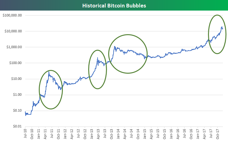
Those who have been around the crypto block know that this isn’t bitcoin’s first rodeo with big price swings. Below is a comparison of past “bubble moves” for Bitcoin’s price. Of course, the volume of bitcoin traded during past bubbles is nowhere near current volume, but the investor psychology remains the same.

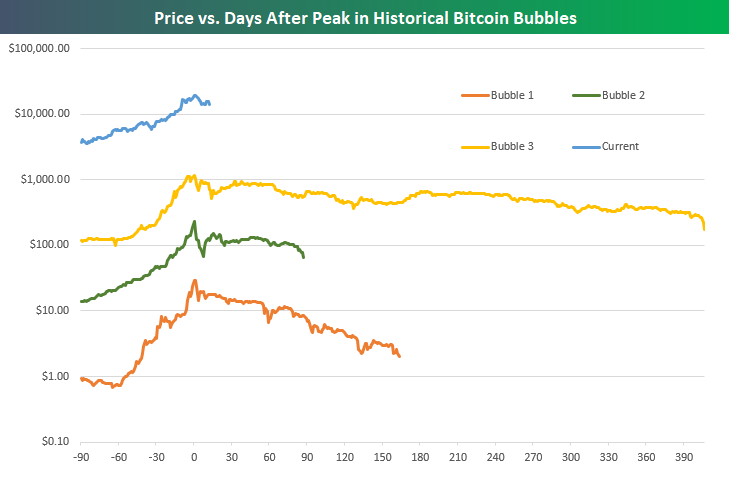
Below is a chart of the price movements for the circled bubbles above, labeled in chronological order. On the Y axis is price for a single bitcoin, and the X axis is days before and after the peak of the rally. The chart shows price 90 days prior to the local peak, as well as the price into the next low between peaks. Note that the price is charted using a logarithmic scale, so the distance between one major interval to the next represents a tenfold change in price. While it’s notoriously hard to call a top, especially in the cryptocurrency world, historical comparisons to recent price action look like a bearish signal for the near-term.


Leave A Comment