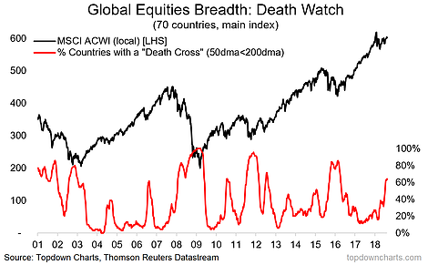
Given the swiftly changing picture in global markets, this is a key chart to keep on your radar. In fact, I like this chart so much that it actually featured in my top 10 charts to watch for 2018 back at the start of January. What it shows is the proportion of the 70 countries we monitor whose stock market has seen a death cross (50-day moving average trading below the 200-day moving average). As of the latest data 64% of countries (45 out of 70) are in death-cross mode. Within cohorts, Developed Markets have 48% of countries in death cross mode, while Frontier Markets are sitting at 73% and Emerging Markets at 71%.
So it’s clearly being driven by emerging markets, and this makes sense – I’ve written a lot about the headwinds facing emerging market currencies and EM risk assets more broadly due to the impact of a stronger US dollar and Fed tightening (rate hikes and QT). And this is where indicators like the one in this chart prove their value by flagging the emergence of real fundamental issues in drawing on information in the price. So the key takeaway from this chart is that below the surface there is trouble stirring in global equities.


Leave A Comment