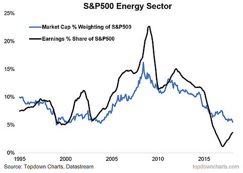
This week the “Chart of the Week” looks at the energy sector of the S&P500 and specifically how it fits in in terms of market capitalization weight and share of total earnings across the index. Simply put, energy stocks have fallen to the lowest market cap weighting since late 2003 (and again at the height of the dot com boom). Part of this is down to the disastrous few years the energy sector has been through following the commodity crunch of 2014-16, and part of it is crowding-out from the super heavyweight sectors of Tech, Financials, and Healthcare.
The chart comes from a broader discussion in a report on the outlook for energy stocks and oil price. With a number of short-term and medium-term factors lining up to at least support if not push oil prices higher from here, it raises the question as to whether this chart represents a long-cycle low point for the energy sector.

However, to play devil’s advocate for a second, students of the history of market cap weights across sectors in the S&P500 would be quick to point out that there has been a number of sectors go from low to lower. For example Telecoms went from about 8% in 1995 to now 2%, Materials went from 7% to 3%, and Utilities from 5% to 3% (the 3 smallest sectors). So to draw parallels you might argue that energy is entering into a new-normal.
Longer term this argument might prove correct as technology and other sectors grow to take increasing share of the index and as structural forces weigh on and change the nature of the energy sector. But though structural trends are important to be mindful of, I would say the cyclical story is more interesting for investors, and there are a few good reasons to expect perhaps some mean reversion in energy sector weights as energy with a current market cap weight of 5.5% sits below the long term average weighting of 9%. Something to think about…


Leave A Comment