Reader Ed Hanson makes a puzzling assertion regarding trade policy measures announced by Mr. Trump, and the evolution of policy uncertainty as measured by Baker, Bloom and Davis:
As for the uncertainty, I can not make your author’s calculation but I can look at the front page of the policyuncertainty.com site and look at the headline monthly index they present. All the countries, except India, show a similar chart. So I doubt if such uncertainty across the spectrum is caused by a minor thing such as TPP. But I would not be surprised if some of the spike is coming down from the Chinese US trade spiff. Both these countries show very similar recent chart.
In response to my expressed dubiousness, he writes:
I believe you when you say, “I honestly don’t see what he’s claiming.”
But if you had followed what I said and understood that I wrote of the Monthly Economic Uncertainty Indexes found on the front page at
http://www.policyuncertainty.com/
Just click or watch as they scroll by the circle blips 1,4,5,6,7.and 8. You will see the Global, US, UK, European, Chinese, and Indian monthly index. They look as I described. And no excel, the very good website does it. Quite user friendly.
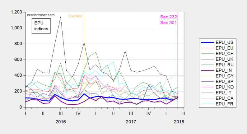
Here is a plot of the monthly indices for the past two plus years. My impression is that India actually covaries a bit more than the others, contra Hanson.

Figure 1: EPU indices accessed 4/13/2018, for US, EUrope, CHina, UK, INdia, GermanY, SPain, KOrea, ITaly, CAnada, FRance. Source: FRED and policyuncertainty.com.
So, apparently, similarity is in the eye of the beholder. Lesson 1: Eyeballing comovements by inspecting individual time series graphs separately, and inferring patterns therefrom, is a ill-advised.
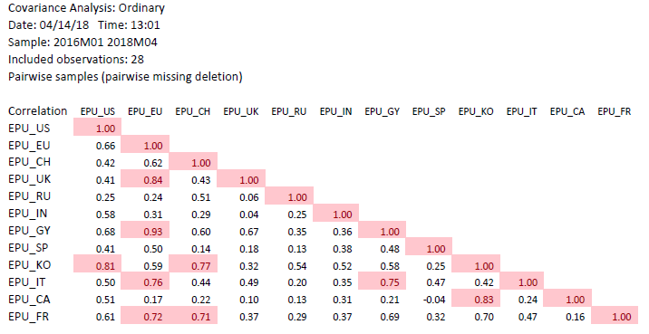
What does a formal evaluation of correlations indicate? In the table below, I present the correlation coefficients for the above indices, for the indicated sample.


Leave A Comment