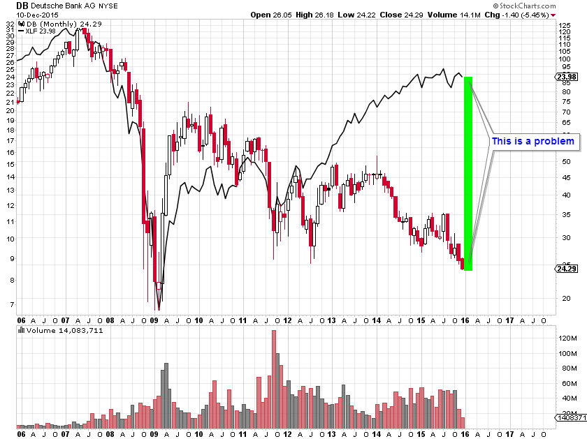
I have been writing about Deutsche Bank for about six months now. My first post, back in October 2015, showed how DB, then trading above $29/share, was sitting on multi-decade support. The chart was showing warning signs that bad things were on the horizon, particularly if it broke below $25.
Low and behold, price did indeed break below $25 which I noted in my December 11, 2015 post titled Deutsche Bank: Something is Seriously Wrong. I showed again not only how broken the long-term chart was, but how DB had grossly underperformed relative to its financial peers (re-posted here):

Things went from bad to worse for the big German bank as it has plunged 40% since my December post and now sits in the low $15s. This is remarkable given the size of the bank. Remember, it’s not only Germany’s largest bank (by a mile), but it also has nearly €55 Trillion in total derivative exposure. To put that in context, the entire German GDP is approximately €3.0 Trillion. Long story short, here’s an updated monthly chart of DB with some support and resistance lines thrown in. That MACD is just atrocious…

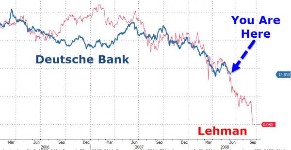
ZeroHedge has been all over the Deutsche Bank story as well. In their post from yesterday, they again compared DB’s price action to that of Lehman Brother’s from 2007-2008 right before they went under. It’s a compelling chart and worth noting the similarities:

Getting on to the point of this post, I want to show you that while all eyes are on Deutsche Bank, there’s another massive European bank that’s in exactly the same death spiral as DB. It hasn’t received nearly the same amount of press, but the charts are nearly identical. That bank is Credit Suisse – the Swiss bank with a $26 Billion market cap, negative earnings and over a $1 trillion. Does this look chart remind you of anything?


Leave A Comment