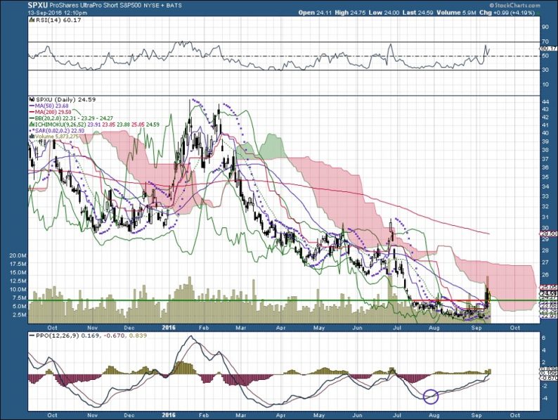
The theory about using charts as a tool for making investment is that the chart is a compilation reflecting all known information about an investment. It occurred to me one day that none of my earlier columns has specifically mentioned that important fact.
However, one of my early columns talked about market seasonality, and ways to get leveraged bang for your buck when the market is taking a hit. The chart above is an update on the main chart I used in that column – a vehicle for strong gains in a down market. As I explained in that column, it is a highly leveraged bet against the S&P 500.
As you can see, this is an investment for nimble fingers. If you held it for any length of time during the last year, you would probably have lost money. An as the chart at the end of this article shows, the same principle applies – in spades – if you had owned this vehicle and held it since it was created at the end of the last decade.
So why am I even talking about it? Because it can be a useful place to store your cash for very brief periods, like now, when there is talk about possible increases in interest rates.
In the chart above, I placed a circle that may be significant. On the PPO line, you will notice a buy signal that goes back about six weeks. That signal is also apparent on the five-year chart below, where it seems more compelling.
The chart above also has a red-green support/resistance line, which shows this vehicle pushed up through resistance. That said, the Ichimoku Cloud still says “beware.”
I picked up some units yesterday, and I am prepared to unload at any time. Talk about interest rates is the key to what’s happening here: Which governor of which Fed is saying what? Which party will take the presidency in the upcoming election?
Of course, I never recommend investments at all. I know how much risk I can handle. Only you can decide whether an investment like this would keep you awake at night, or whether you are sufficiently attuned to the market to get out on time.


Leave A Comment