What do modern stock market analysts and 17th century Japanese rice traders have in common?
A little more than you may think.
In fact, both have been known to be fond of a very particular charting technique to describe trading sessions. Today, we call this style of stock chart a candlestick chart, and it is regularly used by investors and technical traders to gauge the momentum of securities.
CANDLESTICK CHARTS
Today’s infographic comes to us from Hantec Markets, and it provides an introduction to how candlestick charts work. Further, it explains some common patterns, and how they are generally interpreted by investors.

Candlestick charts are often used by traders to help interpret the day-to-day sentiment behind a security.
If the sentiment changes, a trend reversal may be in store – and an opportunity to take advantage could be in sight.
THE BASICS
Candlestick charts show the price action of a security over time, and each individual candlestick indicates four pieces of data for a particular session: the high, open, close, and low price for a security.

Meanwhile, the color of the candlestick indicates the direction of the session: white means the close was higher than the open (bullish), while black means the close was lower than the open (bearish).
Note: it’s common to see candlesticks charted using green and red colors, as well.
PATTERNS WORTH KNOWING
While recognizable trading patterns with candlestick charts can get complex, there are some important nuts and bolts to consider beforehand:
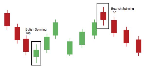
Spinning Top: These have long shadows and short bodies, taking the shape of a spinning top toy. They can be interpreted as indecisive periods of trading – and if following a long uptrend or downtrend, could be seen as showing the bulls (or bears) losing control.

Marubozu: A marubozu is only represented by a body, meaning the high and low are the same as the open and close. In other words, these are very bullish or bearish, depending on their color.


Leave A Comment