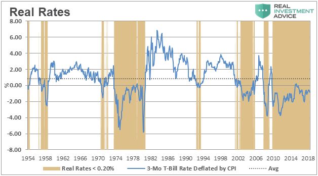
This chart is courtesy Real Investment Advice.com and borrowed from a recent article: ‘Wicksell’s Elegant Model’. The brown areas in the chart highlight the periods when ‘real rates’ were and are negative. Gold tends to perform best during those periods.
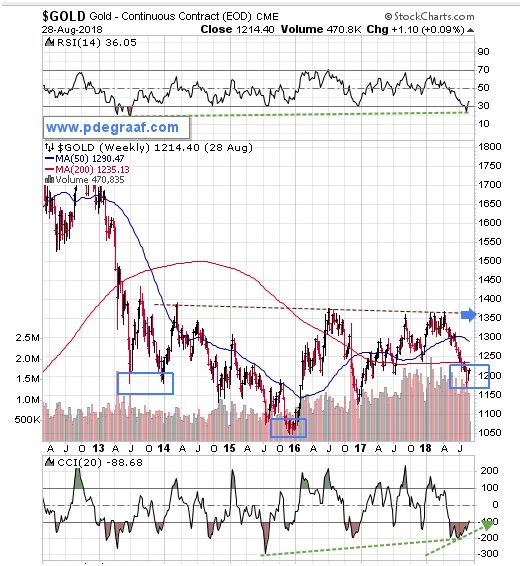
Featured is the weekly gold chart courtesy Stockcharts.com. The pattern indicates the likelihood of a developing ‘inverted head and shoulders’ formation. Watch for a turnaround here to carve out the right shoulder. A breakout at the blue arrow will confirm the pattern, with a target at $1650.
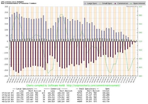
This chart courtesy [email protected] shows the ‘net short’ position of commercial gold dealers has evaporated for the first time in years – perhaps for the first time ever. As a percentage of open interest the number is very bullish at 0.4%.
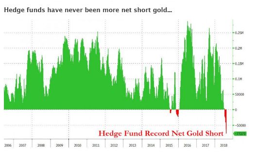
This chart courtesy Zerohedge.com shows hedge funds have NEVER been more ‘net short’ gold. Hedge funds are often referred to as the ‘dumb money’. The last time these funds were somewhat short (compared to today), was in December 2015 – see chart). That was when gold moved from $1050 to $1375. Is history about to repeat?
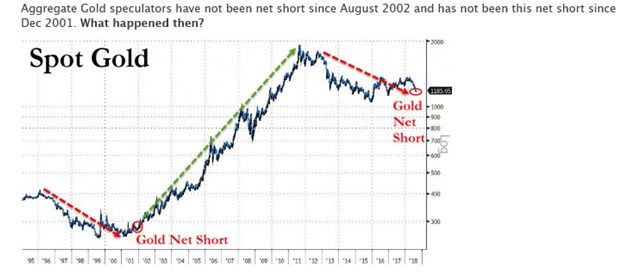
This chart is courtesy Bloomberg.com shows a situation today that compares to a set-up in 2002. Gold back then rose from $275 to $1925.
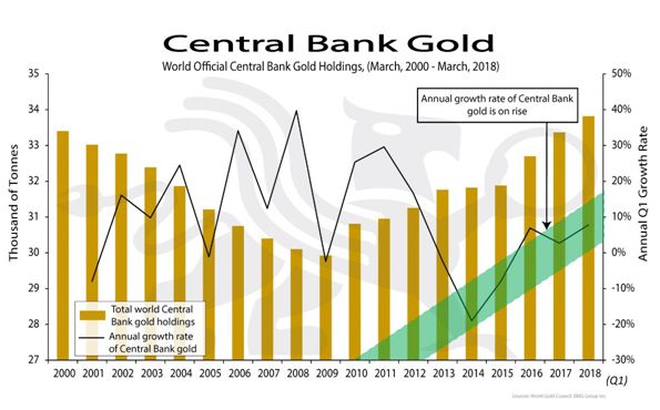
This chart courtesy BGMBullion.com shows a steady increase in the amount of gold that is being acquired by Central Banks, since the end of the last financial crisis. Since Central banks are hoarding gold, we can assume that these bankers anticipate a future role for gold in the world’s financial system.
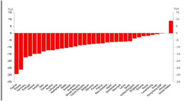
This chart dated April 2018, and courtesy IMF and Deutschebank shows several dozen countries and the expected % Change in Government Debt-to-GDP Ratios for “Advanced” Economies. Most of the countries listed are expected to reduce this ratio, but the USA is shown here as likely to increase its debt to GDP ratio by 9%. This increase in the level of debt will cause the US dollar to depreciate. Investors are likely to seek gold and silver for protection.


Leave A Comment