The new update to 3Q labor share came out today. The last two quarters were revised firmly upward. Investors may be concerned about profits after these revisions.
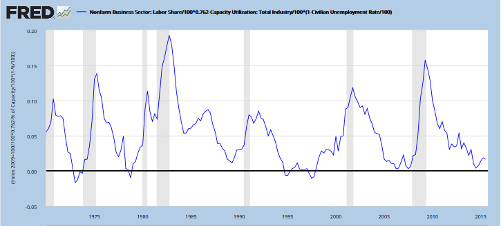
I have my own estimation of an effective demand limit upon a business cycle which is based on labor share, capacity utilization and unemployment. Labor share represents effective demand. The graph basically measures spare capacity as the difference between labor share and a composite of utilizing capital and labor. The more labor share, the more spare capacity can be utilized.

(link to graph and equation)
The current business cycle has followed perfectly so far my projection that the plot line would be limited by the zero lower bound, as has been the case for decades. Many well-known economists doubted my projection. So we may end up opening a paradigm shift in economic insight…
The question remains whether the plot line will bounce off of the zero bound again as it did before the last two recessions or start heading upward toward another recession.
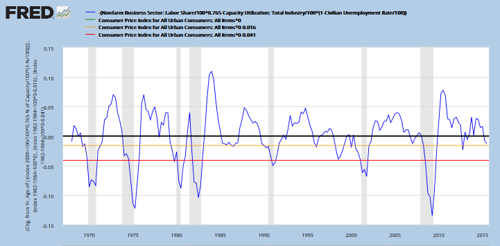
The movement of the plot line above can be used in another graph to signal the probability of a recession. As spare capacity starts to rise after hitting the effective demand limit, the economy rides the edge of a recession.

When the plot drops below the yellow line, a yellow flag goes up for a recession. If the plot drops below the red line, we are in recession. The plot line dropped below the yellow line in 4Q 2012, but the economy hadn’t reached the effective demand limit yet.
Currently, the plot in the first graph has reached its effective-demand zero lower bound… and is near, but not below, the yellow line in the 2nd graph. So fingers on the yellow flag, but not raising it yet.


Leave A Comment