Since Spring is in the air here are some colorful charts to show you where we feel the price of stocks are within the current bull market.
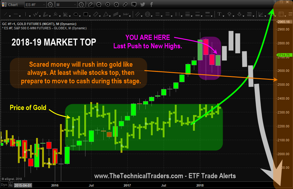
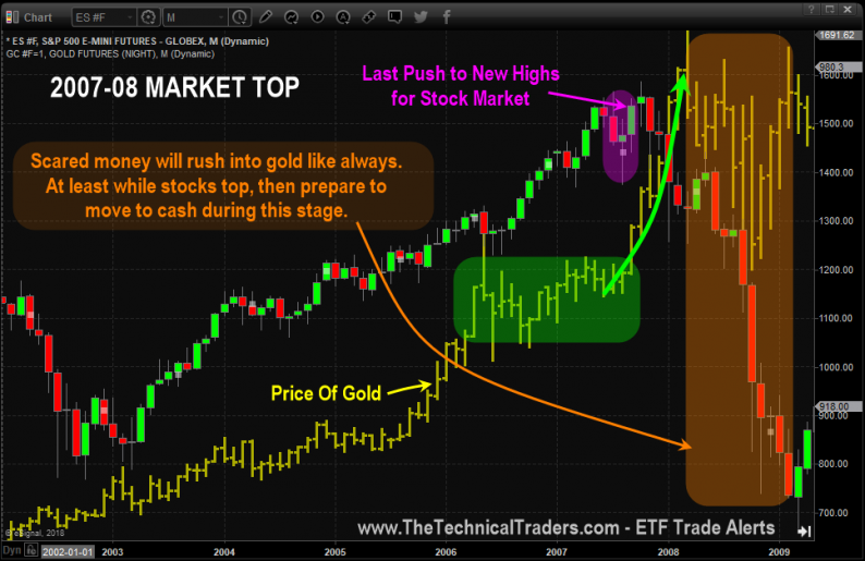
Below are monthly charts of the SP500 index and the price of gold. The first chart shows a pattern that gold formed just before stocks hit all-time new highs and the bear market started.
The chart is a little noisy, lots of analysis, but we color-coded each area to break it into clear bits size analysis. The chart shows you what happened and what is likely to happen again.

YOU ARE HERE IN THE STOCK MARKET
This is the current monthly chart, and if you compare the price action with the above chart, you can’t help but think things are set up in a similar formation as 2007 – 2008.

WHAT DOES ALL THIS MEAN?
It means the stock market is nearing a significant top and all everyone’s long-term buy and hold investments should be reviewed and prepared for a rebalancing later this year. Precious metals should do well this year, stocks should top out and for you to preserve hard-earned money cash is always king for those who don’t actively trade. But if you do trade or you are an active investor huge amounts of money can be made during times of increased volatility, precious metals, and falling stock market prices.
TODAY’S STOCK MARKET ANALYSIS – WED APRIL 18TH
What an AWESOME DAY!
All our positions rocketed higher with our most recent entry in SIL (silver miners) leading the way.
We closed our TNA position to lock in 17.7% on the second portion of that trade.
Yes, we do feel the markets will run higher, but we also like to lock in the quick, easy money trades like TNA especially when the overall market is looking and feeling a little top heavy for a day or three.
The chart below of the SP500 index paints a color picture of what I feel will unfold in the very near term.


Leave A Comment