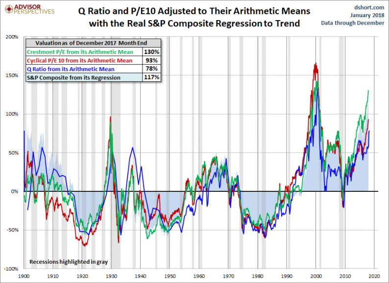
Here is a summary of the four market valuation indicators we update on a monthly basis.
To facilitate comparisons, we’ve adjusted the two P/E ratios and Q Ratio to their arithmetic means and the inflation-adjusted S&P Composite to its exponential regression. Thus the percentages on the vertical axis show the over/undervaluation as a percent above mean value, which we’re using as a surrogate for fair value. Based on the latest S&P 500 monthly data, the market is overvalued somewhere in the range of 93% to 130%, depending on the indicator, up from 77% to 125% the previous month.
We’ve plotted the S&P regression data as an area chart type rather than a line to make the comparisons a bit easier to read. It also reinforces the difference between the line charts — which are simple ratios — and the regression series, which measures the distance from an exponential regression on a log chart.

The chart below differs from the one above in that the two valuation ratios (P/E and Q) are adjusted to their geometric mean rather than their arithmetic mean (which is what most people think of as the “average”). The geometric mean increases our attention to outliers. In our view, the first chart does a satisfactory job of illustrating these four approaches to market valuation, but we’ve included the geometric variant as an interesting alternative view for the two P/Es and Q. In this chart, the range of overvaluation would be in the range of 91% to 145%, up from last month’s 90% to 140%.

The Average of the Four Valuation Indicators
The next chart gives a simplified summary of valuations by plotting the average of the four arithmetic series (the first chart above) along with the standard deviations above and below the mean.


Leave A Comment