I’ve pointed out many times that, generally speaking, mortgage rates lead home sales. It’s not the only thing — demographics certainly plays an important role — but over the long term interest rates have been very important.
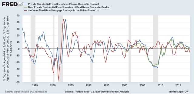
I have run the graph comparing mortgage rates to housing permits many times. In the graph below, I’m using a slightly different housing metric — private residential fixed investment as a share of GDP, both nominal (blue) and real (green), current through last Friday’s report on Q2 GDP. Here’s the long term view:

We can see the leading relationship over the large majority of time frames in the last 50 years, with a few notable exceptions: the late 1960’s and 1970’s *huge* demographic tailwind of Baby Boomers reaching home-buying age, the 2000’s housing bubble and bust, and 2014 (mainly due to the Millennial generation tailwind).
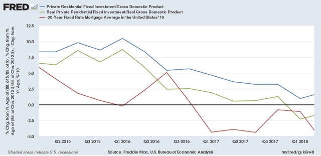
Here’s a close-up of this same graph beginning in 2015:

The increase in mortgage rates since late 2016 (blue in the graph bleow) has had a larger effect on private residential investment than the 2013-14 episode, probably because house prices are higher in real terms, as shown in the below comparison with wages (red):

House prices were near their 2012 housing bust bottom the first time mortgage rates went up. Now they are about 20% higher in real terms.
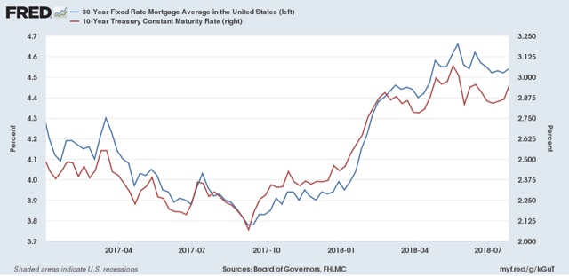
Finally, here is a more granular view of Treasury and mortgage interest rates over the past 18 months:

The decline in mortgage rates back below 4% in the middle of last year is probably what sparked the big increase in housing permits, starts, and sales last autumn and winter.
But because mortgage interest rates have actually increased a little bit over the last six months, I’m not expecting a similar rebound in housing this autumn.
At the same time, I can’t see much of a significant outright ‘decline’ in YoY housing sale metrics — on the order of what we saw in 1999 before the 2001 recession — unless mortgage rates increase, at a minimum, to over 5%, and probably to 5.25%. We’ll see.


Leave A Comment