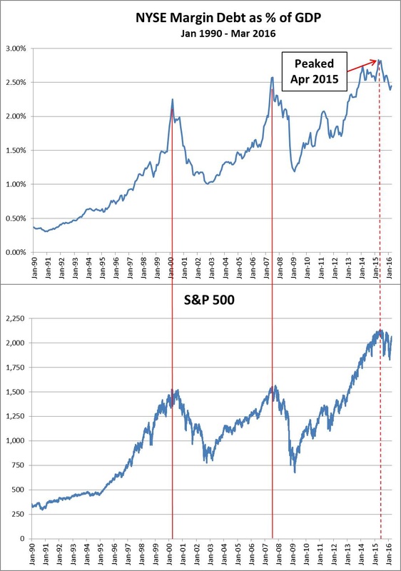
From Goldsqueeze: Just one chart for today – it’s one that I update every so often because I think it’s a worthwhile indicator to follow. The NYSE reports total margin debt each month (with a several week lag) on its website, linked here. Margin debt, as you know, is money borrowed to invest in equities. The higher margin debt goes, the more money is being poured into stocks. The absolute value of margin debt isn’t terribly meaningful because you have to take into account inflation, a growing number of investors, etc. What is meaningful, however, is anchoring margin debt to the U.S. Gross Domestic Product. Taking this ratio allows us to follow the level of margin debt relative to the size of our economy.
For the past 25 years, peaks in margin debt to GDP have coincided almost perfectly with major, cyclical peaks in the S&P 500. This is relevant today because margin debt to GDP peaked in April 2015 at 2.83% and it has been trending lower ever since. And do you know when the S&P put in its most recent cyclical high: May 2015. Yikes. I think the graph below speaks for itself.


Leave A Comment