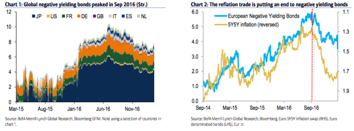
On Monday in “Was $13 Trillion Peak Negative?” I highlighted the following two charts …

(BofAML)
…on the way to suggesting that perhaps – just perhaps – the reflationary momentum that seemed to reassert itself late last summer and which was given a Pulp Fiction-style adrenaline shot to the chest following Donald Trump’s election, might mean that we’ve seen the peak in negative yielding debt.
To be sure, French election risk has also contributed to a decline in sub-zero yields even as bunds pull in the opposite direction.
Well on the heels of that, I thought readers might find the following chart of interest as it simply answers the logical question one might pose after looking at the charts shown above: “what percentage of debt globally has a negative yield?”

(BofAML)
The only question now is whether the long list of “known unknowns” eventually conspires to put the brakes on the reflation meme and trigger a central bank response that plunges us right back down the “accommodative” policy rabbit hole.


Leave A Comment