A curious trend has emerged within one of the world’s major equity benchmarks: the S&P 500. As passive or index investors should be well aware, their portfolios will change over time as the index changes. So it’s arguably a key development that the S&P 500 has become increasingly lopsided.
The chart comes from the latest edition of the weekly macro themes report and was part of a wider discussion on sectors in the S&P 500 (and how the bulk of returns are being driven by Financials and Technology).
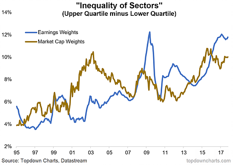
The chart: this chart shows the difference between the upper vs lower quartiles of sector weights… i.e. the gap between the largest and smallest sectors of the S&P 500.

The chart shows both the market cap representation and the earnings representation. This is important to note as it’s not just a price phenomenon, it’s also an economic or earnings issue. But the bottom line is that sector inequality or the gap between the largest and smallest group of sectors has nearly tripled since the mid 1990’s.
For a passive investor which simply deploys capital based on market cap weights (which is what most index investors do – certainly for those investing in market cap weighted indexes), this means the portfolio they own now is materially different from the one back in the 90’s.
In fairness, over time this can be a good thing as the winners of longer term thematics and structural changes will grow in market cap, and industries in decline will invariably shrink over time, so there is some merit in it.
The risk comes when a sector or group of sectors generate an unsustainable majority in earnings and/or market cap weighting, which makes for a lopsided portfolio allocation. Indeed a market cap weighed approach basically seeks to allocate more to those sectors most at risk… just think about a market cap weighted portfolio at the peak of the dot-com boom which would have had about 1/3 of its money in tech.


Leave A Comment