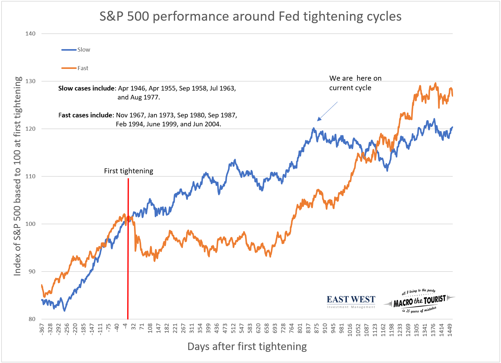
It’s 819 days since the start of the Fed tightening cycle. Why would I know that so precisely? Because I just finished creating a chart of the stock market performance before and after the first fed tightening.
Indexing the stock market performance around certain events like the first Fed hike is not novel. Tons of market strategists create these sorts of visuals. But Ned Davis created a chart I found so fascinating – what’s that line about good and great artists? Well, I am stealing it.
Actually, I just wanted to see it updated, so I thought it was worth recreating from scratch, but all the credit goes to Ned.
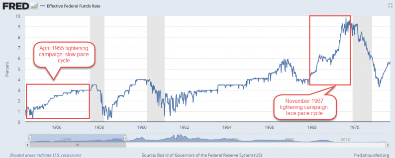
As I mentioned, in a lot of ways it’s just a regular piece of research. The truly insightful part of Ned’s chart was to divide the tightening cycles into slow and fast campaigns. For example, when the Fed began hiking in April of 1955, they raised rates at a gradual, slow pace. This was in contrast to November of 1967 when the Federal Reserve raised rates quickly.

Taking each Fed funds tightening cycle, Ned divided them into slow or fast campaigns. He then took the return of the S&P 500 around those periods. Day 0 represents the first hike and at that point, the S&P 500 is indexed to 100. Taking each bucket, an equal weighted average of the S&P 500 performance is created.
So without further ado, here is the chart of the performance of the S&P 500 before and after the first tightening, but grouped by the speed at which the Fed raised rates.

The fast tightening cycles have typically seen an initial underperformance. But then, they catch up, and by the third year, they actually outperform slower tightening campaigns.
The really interesting part? Today, we are sitting at the outperformance peak for the slow cycles. So if you accept that the current slow tightening cycle plays out like previous ones, then the stock market is about to drift lower in the coming year.


Leave A Comment