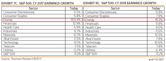
One factor utilized in uncovering potential investment opportunities is to evaluate companies and sectors that are projected to generate strong earnings and cash flow growth over the course of the next year or more. The risk associated with simply reviewing earnings growth rates is the fact other variables often influence the future price performance of a company’s stock. A good case in point at the moment can be found in evaluating energy companies and the associated sector. For calendar year 2017 and 2018, the energy sector is expected to exhibit the highest earnings growth rate among all the S&P 500 sectors. For 2017 the year over year earnings growth rate for the energy sector is estimated to equal over 300%. In 2018 the YOY growth rate is projected to equal 41.3%.

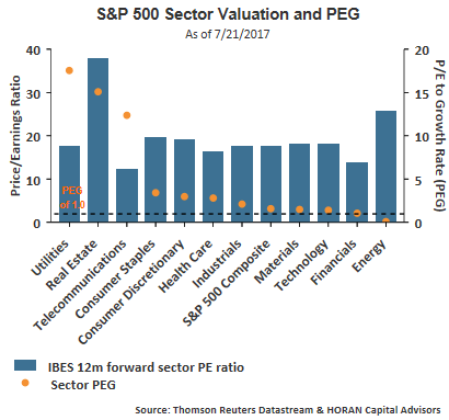
Even reviewing the sector PEG ratios (P/E to earnings growth rate), the energy sector looks very attractive and is the only sector that has a PEG below 1.0.

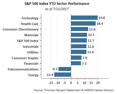
So, looking at earnings growth and PEG ratios, the energy sector certainly looks like one that should reward investors from a return standpoint this year. In reality though, the energy sector has been the worst performing sector on a year to date basis.

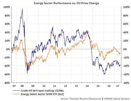
Obviously, other factors must be at play as it relates to the performance of energy stocks and the energy sector. One critical issue with energy investments is the direction of oil prices. The below chart compares the performance of WTI Crude Oil versus the performance of the Energy Select Sector SPDR ETF (XLE). Obvious from the chart is the performance of both are highly correlated. Although not shown, the correlation of the price of oil and the price of XLE is +.83. In other words, nearly 70% (.83 squared) of the price movement of XLE can be explained by the price movement of WTI crude oil.

So with energy stocks doing so poorly in spite of the strong YOY earnings growth expected for the next two years, the market may be expecting the level of oil prices to remain steady or even fall from current levels. This point of view is not out of line with some of the energy supply fundamentals. The first chart below shows crude oil inventory (green line) remains far above inventory levels seen during 2010-2014. The inventory level has taken a dip lower recently, however, rig count continues to move significantly higher and is up by 488 rigs to 950 rigs versus a year earlier.


Leave A Comment