
If I were to choose one word to describe the current market, it would have to be tedious. The Dow Jones is no longer going up, but as we see in its BEV chart below, it’s really not going down either.

The Dow’s BEV chart begs the question of whether its next move will be to make a new all-time high (BEV Zero) or decline down to its BEV -5% line. I’m inclined to expect the Dow will break below its -5% line above.
However, the Dow Jones (Blue Plot) with its step sum (Red Plot) below shouldn’t inspire the bears to short the market.
The step sum is a single item A-D line using a market series’ own daily advances and declines in its construction. The best way to understand the information gained by studying a step sum is that it’s a measurement of market sentiment.
For the past month the traders on Wall Street have been heading for the tall grass if the red step sum plot below is to be believed. Still, with the Dow Jones seeing an overwhelming number of daily declines over daily advances since the beginning of March, the Dow Jones has only declined by 2.18% from its last all-time high as of the close of today (see BEV chart above).
If the current advance wasn’t long in the tooth, which this one is, I dare say that one should be bullish on the stock market, which I’m not.

One bearish factor in this market is that the Dow Jones Total Market Groups’ (DJTMG) top 20 (the number of groups within 20% of their last all-time high) peaked in July 2014 at 52. The top 20 in the chart below closed the week at 46, and is in no hurry to break above its highs of three years ago.
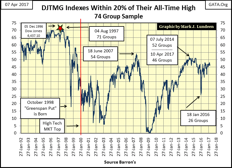
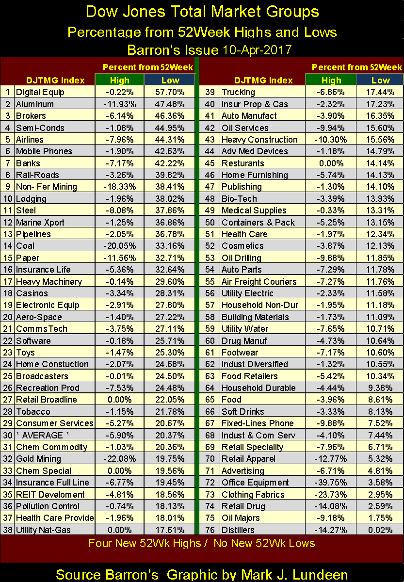
The DJTMG’s frequency distribution table below tells the tale. The top 20 data is found in the column labeled 20% From All-Time High, which is simply the sum of groups from columns BEV Zero (All-Time Highs) down to the -15% column.
The problem for the bulls in this market is that it lacks the “liquidity” to drive those groups in the -20% and below columns, up towards their last all-time highs. Until this happens (which it may not) I don’t expect we’ll see much excitement from the stock market.

The banks have done well since the November elections.
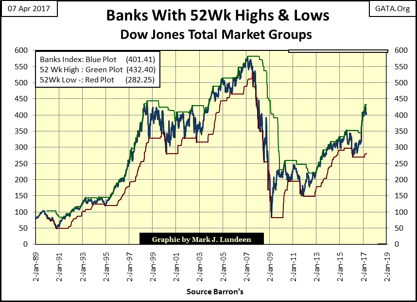
They closed the week at #7 in the DJTMG’s 52Wk Highs and Lows table below.
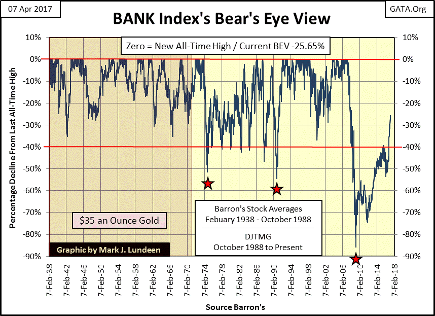
But the banks are still damaged goods as far as I’m concerned. The problem can be seen in their long-term BEV chart below. Before the dollar was taken off the Bretton Woods $35 gold peg in 1971, the banks never saw a bear market decline in excess of 40%. After 1971, they’ve fallen below their BEV -40% line far too frequently to be called investments suitable for widows and orphans.
In March 2009 they outdid themselves by declining over 80% from their sub-prime mortgage highs. They may have fallen down below their -99.99% line had the government not bailed them out with a few trillion dollars of “liquidity” and an embarrassing change in accounting standards on their sub-prime reserves that’s still in place.
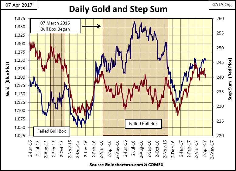
I find the gold and silver markets tedious too, but have bullish expectations for the old monetary metals for the months and years to come.
Every day this week gold closed above $1,250. I like that. But what this market really needs is a close above last summer’s highs to really get things going.
Moving on to gold’s and the Dow Jones’ step sum and 15 count table below, it’s apparent how both markets have seen more declining than advancing days in the past month. In the past twenty-five trading sessions, gold’s step sum is down by two days, yet the price of gold has advanced by twenty-nine dollars (2.34%) since March 6th.
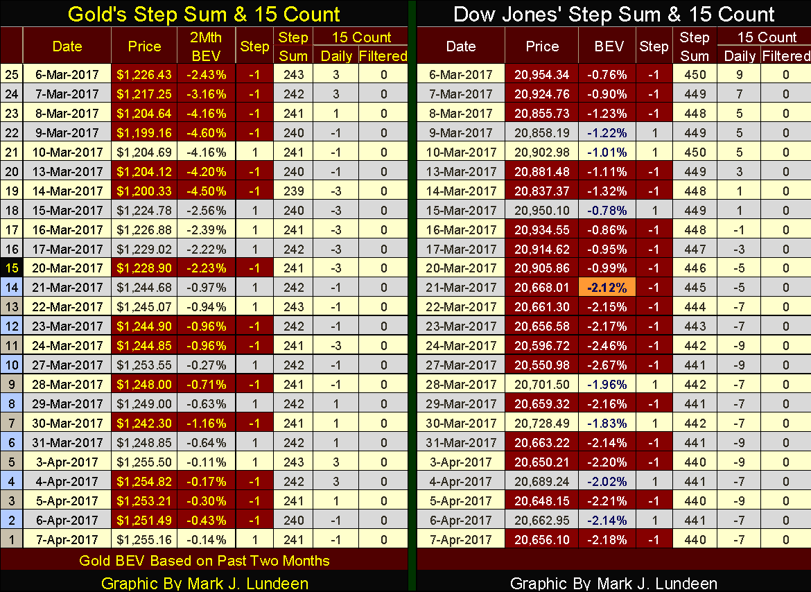
The Dow Jones is down by 298 points (-1.42%) since March 6th, however most of that decline occurred in a single trading session (March 21st). The Dow Jones has done remarkably well considering that in the past twenty-five trading sessions, it’s seen only seven advancing days. Like gold, the Dow Jones, my proxy for the general stock market doesn’t want to go down.

Related Posts
 Agriculture Markets Report – Tuesday, April 18
 Stocks And Precious Metals Charts – Repentance And Forgiveness The Wellspring Of Joy
 Stocks, S&P Futures Plunge After Trump-Kuroda Double Whammy
 Forex Metrics And Chart Week 50 / 2017
 US Business Cycle Risk Report December 18, 2015
 Bitcoin bull outlines 7 steps to more fiscal stimulus and higher BTC prices


Leave A Comment