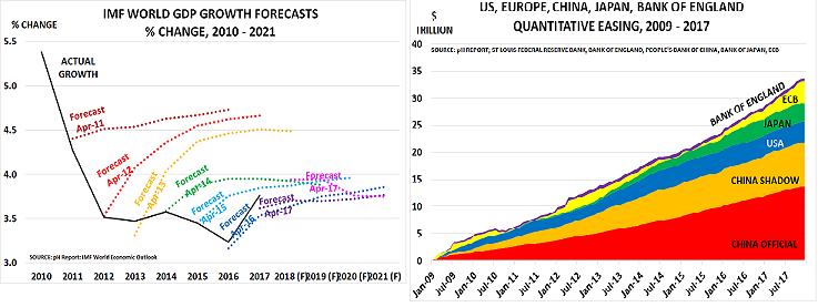
The results of the central bankers’ great experiment with money printing are now in, and they are fairly depressing, as the charts above confirm:
As the IMF headlined last week, “current favorable growth rates will not last”.

The chart above shows what happens if you spend a lot of money without getting much return in terms of growth. Again from the IMF, it shows that total global debt has risen to $164 trillion. This is more than twice the size of global GDP – 225%, to be exact, based on latest 2016 data. The IMF analysis also highlights the result of the money printing:
“Debt-to-GDP ratios in advanced economies are at levels not seen since World War II….In the last ten years, emerging market economies have been responsible for most of the increase. China alone contributed 43% to the increase in global debt since 2007. In contrast, the contribution from low income developing countries is barely noticeable.”
 It doesn’t take It doesn’t take a rocket scientist to work out the result of this failed policy, which is shown in the the IMF:


Leave A Comment