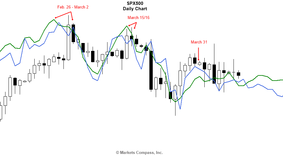
About a month ago, I shared with you the following daily chart of the SPX500 and told you about the importance of the end of February/early March time frame as a key reversal date for equities. US equity markets were continuing to make record highs at the time and most people thought that it would just continue going through the roof!

I then posed to you my “million dollar question” about whether the end of February / early March turning point was just a minor correction or a key trend reversal? I also told you that the answer lied with our Master Market Forecast (MMF), which we plot on our charts as lines such as the ones you see in the above chart.
Let me now share with you the MMF picture that we had in front of us all along (without future prices of course), which made me pose that rhetorical question to you, to which we obviously had the answer.

The chart above shows our primary MMF line (blue) and a secondary one (green) plotted on the daily chart of SPX500 as of the time this article was being prepared (April 11th, 2017) with the last price bar showing the movement during the European session before the US markets opened on that day.
As you can see, the market has been following our forecast very closely not only in terms of turning points but also in terms of behavior. If all you had in front of you was this picture back towards the end of February (without the actual prices of course), then the culmination through the end of February / early March time frame followed by a series of lower highs and lower lows would have clearly told you that this was a bearish key trend reversal. In our case, since we see the forecast indefinitely into the future, we have a slightly wider perspective on things, as you would expect.
We had that topping formation in front of our eyes months in advance and the entire market could not help but follow that forecast regardless of what would happen politically, economically, or otherwise.


Leave A Comment