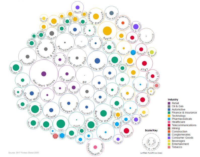
The Top 100 Companies: Revenue Vs. Profit
Just over a month ago, we published a very tidy data visualization that summed up the top 50 companies in the world by revenue, based on data from Forbes.
But, just looking at revenue numbers doesn’t give a full picture on how these companies compare – and many investors care much more about a different performance metric: profit.
Thankfully, today’s data visualization from Ishtyaq Habib shows the top 100 biggest companies by market valu but uses circles to represent both the revenue and profit for each company. There’s also an interactive version of the same chart here as well, which highlights the specific numbers for each company highlighted.

APPLE = A MONEY-MAKING MACHINE
The first noticeable difference in this version, which includes profits?
It’s that Apple is unparalleled in its ability to make money. In fact, Apple’s 2016 profit of $45 billion is far bigger than any other company, including Berkshire Hathaway ($24 billion), JPMorgan Chase ($24 billion), Wells Fargo ($22 billion), Alphabet ($19 billion), Samsung ($19 billion), Toyota ($17 billion), Johnson & Johnson ($16 billion), or Walmart ($14 billion).
The only companies that can compare with Apple were Chinese banks like ICBC, Agricultural Bank of China, or China Construction Bank, but in many ways these state-owned enterprises are on an entirely different playing field, anyways.
Also impressive: Apple’s profits are bigger than the revenues of massive companies like Coca-Cola ($41.5 billion) or Facebook ($27.6 billion).
MARGINS, SCHMARGINS
Unfortunately, not every company can make a 21% profit margin on $217 billion of revenue like Apple.
Other organizations need to rely on razor-thin margins and volume to make things work. Walmart only brought in $14 billion of profit off of a whopping $485 billion of revenue – a margin of just 2.8%. Meanwhile, fast-growing Amazon was in a similar boat with margins of 1.7%, largely provided by its wildly successful AWS service.


Leave A Comment