
I’m seeing a lot of people pointing to last week’s strong rally and making comparisons to October 2014. Here are a few charts that show some big differences between then and now. First is a point and figure chart of the S&P 500 Index (SPX). Last October the decline was deep, but it still held the long term trend that started in late 2012. The current decline broke that uptrend and two more attempts to create a new uptrend. In addition, the decline broke a tight six month price range. This pattern indicates that a lot of distribution was occurring during the sideways trading. This will create strong overhead resistance if price makes it back to the 2040 area on SPX.

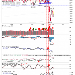
Another chart that shows the difference is SPX with its 50 and 200 day moving averages. Last October the decline started well above the 200 day moving average on SPX. As a result, it was an easier level to reclaim. The current decline started in earnest when SPX broke its 200 dma. That makes the 200 dma a significant resistance level that is still more than 4% above the market (currently near 2075).

Looking at the two charts and several other indicators I doubt we’ll see the same type of “V” bottom that makes it to new highs in the next month. Gains going forward will likely be met with fearful investors selling into strength.


Leave A Comment