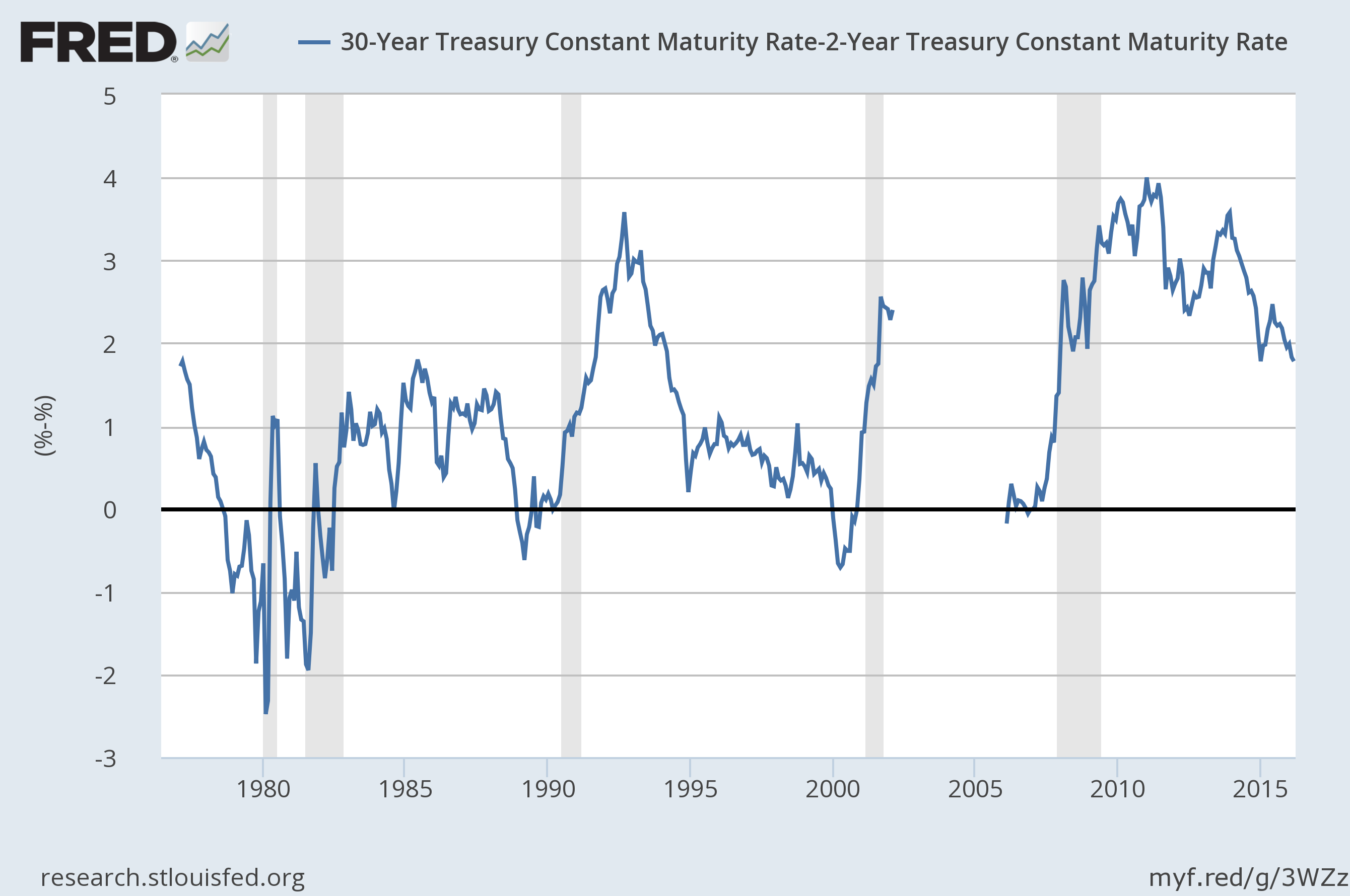
This week, I’ll be focusing exclusively on the treasury market’s performance. Let’s start with a slope of the overall yield curve:

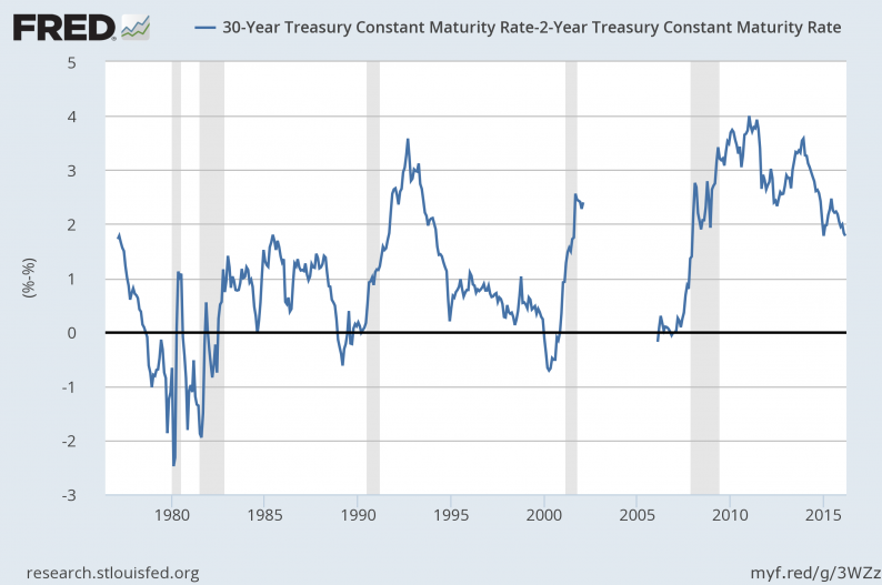
The 30-2 spread is currently 178, nowhere near inversion. The standard interpretation of this is that we’re nowhere near a recession.
The 10-2 spread confirms that interpretation:

The difference between the 10 and 2-year treasury is 96 basis points: we again have a fair amount of room to run before the yield curve signals a recession is imminent.
It’s logical to ask if the unprecedented nature of central bank actions prevents this recession indicator from being predictive, a question that naturally leads to a brief discussion of why the yield curve inverts at the end of a recession. At the short end, the Fed usually begins raising rates to stave off inflationary pressures. At the long end, investors realize the equity rally is over and begin buying treasuries to lock in yield and safety. The combination of these events compresses the yield curve’s spread. Two of these traditional events are now occurring: the Fed is raising rates and investors are buying safety.In short, this recession indicator is still relevant.
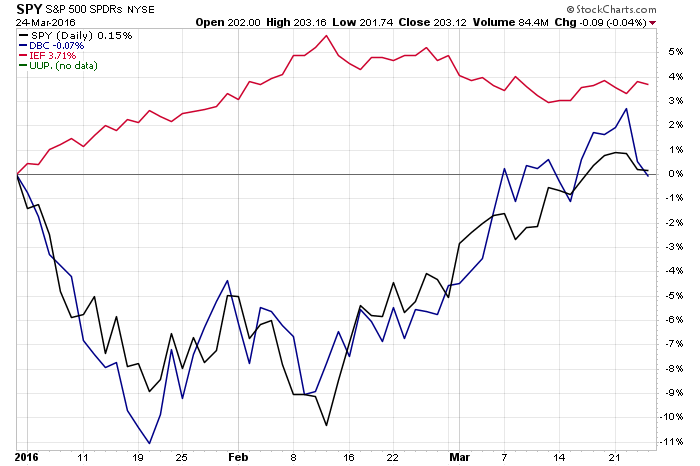
Let’s turn to the treasury market’s overall performance over the last year, starting with a comparison of the four major asset classes: equities, treasuries, commodities and the dollar:


The top chart shows treasuries are the only positive performer over the last year, although the dollar and equities are a close second. The bottom chart shows that, since the beginning of the year, the treasury market is still the best performer.
And finally on the performance front, consider this chart:

The entire bond market complex is doing well; even junk bonds are bouncing back.
Here’s what we can discern from the above information:


Leave A Comment