Normally we look at charts in chronological order, day after day and year after year. These typical chart types show the price path of an asset or index over days, weeks, months, or years and provide a lot of information for technicians to use. Yet there is another way to view charts, and that is to look at them in a seasonal fashion.
A seasonal chart shows the tendencies of an asset or index to move higher or lower, or peak and bottom, at certain points during the year.
Instead of looking at the last 15 years of index data in chronological order, what if we took each one year period, January to December, and printed it on a transparent slide. Then, put each year on top of each other. Doing this would highlight any period of the year that tends to be strong or weak. Luckily, we don’t need to do all that work. We can just take an average of the last 15 or 20 years to show what tends to occur at different times of the year (also see S&P 500 Seasonal Trends).
Below we look at the pattern of US Dollar Index futures which, which can also aid in trading US dollar related currency pairs.
US Dollar Seasonal Patterns
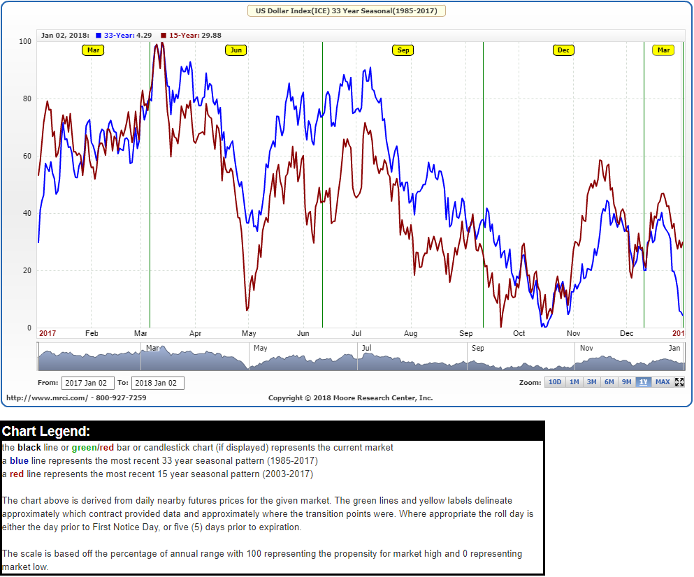
The US Dollar has seasonal tendencies, and we can see them by looking at the following seasonal chart.
US Dollar Index Futures Seasonal Chart- 15 and 33 Year

Source: MRCI.com
The chart shows the tendencies of the US Dollar Index over the last 15 and 33 years. Over these two time periods, while there are variations, overall the tendencies are quite similar.


Leave A Comment