Being a visual learner (as opposed to a facts and figures learner) I always like to look at the market’s pictures in order to tune out idiotic and/or emotional headlines.
While it is best to avoid Swamis who try to convince you that a chart is something more, a chart is just a snapshot in time. It is something that tells you exactly what has happened to the moment. Often there are messages that can be drawn by quantifying history and extrapolating probabilities and trends. But really, it’s just a picture. Here are some ugly ones.
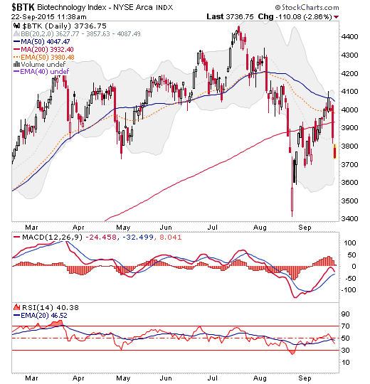
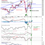
Biotech got Clintonated by a Toxic Tweet, but it was already vulnerable at the MA 50’s.
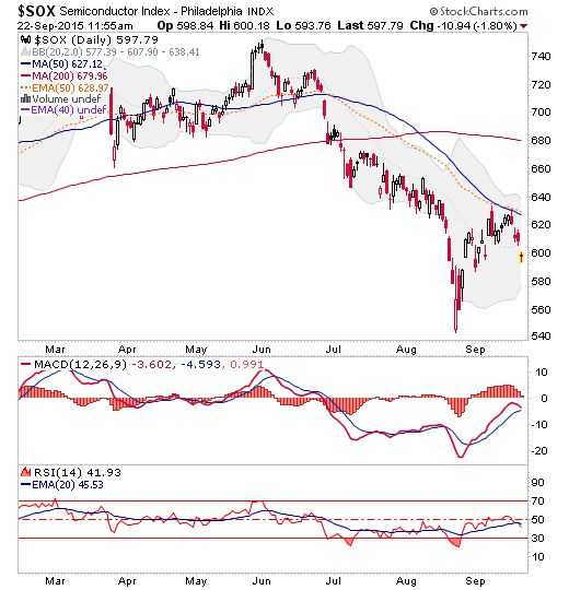
SOX is breaking down at its MA 50’s as well, saying “I don’t care about no stinkin’ book-to-bill ratio; I care about the mitigating words that guy had to say in his statement”per this post.
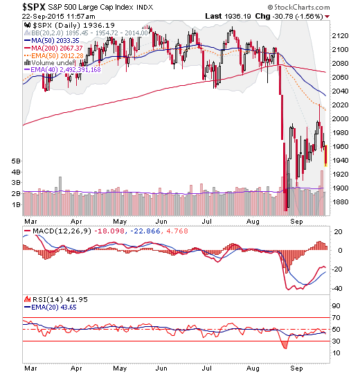
SPX is breaking down from its bounce, AKA bear flag, AKA sucker’s rally after pumping to the EMA 50, but not the SMA 50 (or our bounce target of 2040).
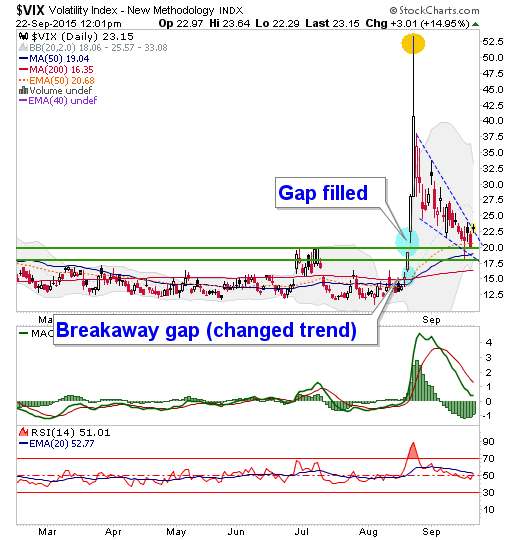
Finally, here is a still-attractive looking entity. The VIX, remains in Flag-like consolidation. Someone who wants to be bullish may look at this and think it is positive, the market is not getting a huge volatility upsurge despite bearish activity. But that is not usually a bullish sign. VIX is however, inching above the line drawn on this chart that was posted over at Biiwii this morning, pre-open.




Leave A Comment