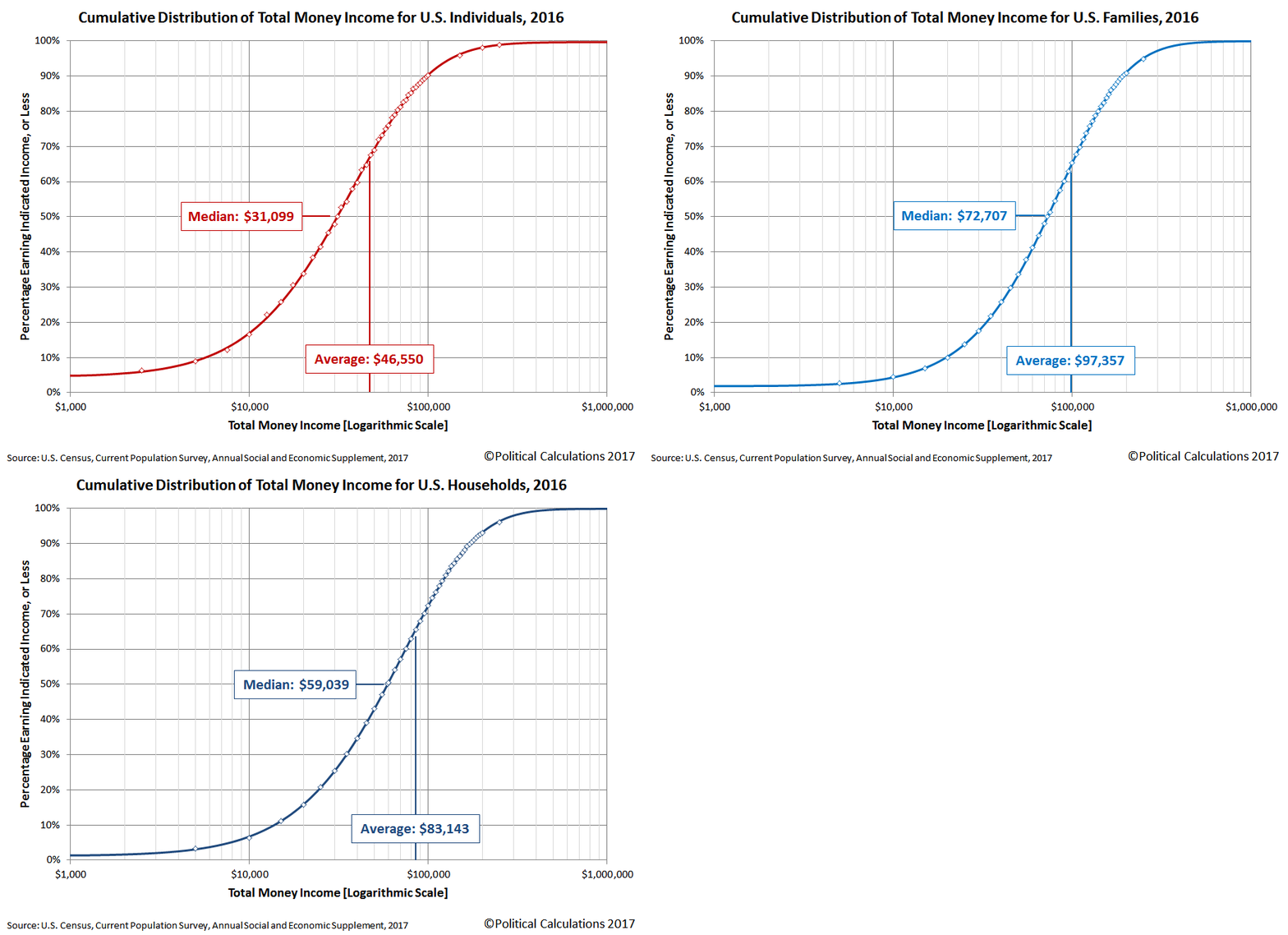
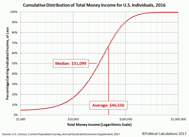
The U.S. Census Bureau has published its annual report on Income and Poverty in the United States, which we’ve used to visualize the cumulative distribution of income for U.S. individuals, families and households in the following animated chart!

The cumulative income data applies for the 2016 calendar year, which the Census Bureau collected through its March 2017 survey sample, which they processed and published on 12 September 2017. Income data for the 2017 calendar year will not be collected until March 2018 and not published until September 2018.
If you would like to see static versions of the cumulative income distribution charts in the animation above for individuals, families and households, we can accommodate you! If you would like to estimate where you fall on the the income distribution spectrum in the U.S. using these charts, all you need to do is find your income on the horizontal axis, trace a vertical line up to where it intercepts the curve on the graph, then trace a horizontal line to the left side of the chart where you can roughly approximate your income percentile ranking on the vertical scale.
If you would like a more precise estimate, we will be updating our “What Is Your Income Percentile Ranking?” tool later today with the 2016 income distribution data. Our tool can also estimate what your income percentile would have been in any calendar year from 2010 through 2015.


Leave A Comment