Those that follow my personal account on Twitter will be familiar with my weekly S&P 500 #ChartStorm in which I pick out 10 charts on the S&P 500 to tweet. Typically I’ll pick a couple of themes and hammer them home with the charts, but sometimes it’s just a selection of charts that will add to your perspective and help inform your own view – whether its bearish, bullish, or something else!
The purpose of this note is to add some extra context beyond the 140 characters of Twitter. It’s worth noting that the aim of the #ChartStorm isn’t necessarily to arrive at a certain view but to highlight charts and themes worth paying attention to.
So here’s the another S&P 500 #ChartStorm write-up!
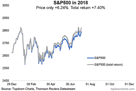
1. S&P500 Total Return Chart: First up is a quick look at the S&P500 in total return terms (i.e. incorporating dividends), the notable point here is that on the 25th of July in total return terms the S&P500 actually made a fresh new high for the year. More an interesting observation than earth shattering insight.
Bottom line: Accounting for dividends, the S&P500 in total return terms has already made a new high this year.

2. S&P500 vs Chinese Stocks: Seems like some people are talking about this chart as a harbinger for US stocks (that it is a gap that needs to close). I would say it’s a logical reflection of the underlying macro currents. China’s economy is cooling due to peaking property price growth, a rolling over of export growth, and the delayed flow through of previous policy tightening. Compare this to America where earnings are accelerating, and economic growth numbers are running hot. What I would note though is that the PBOC is in easing mode, vs the Fed in tightening mode, and Chinese stocks are cheap vs expensive US stocks. So it’s a divergence in price which reflects an underlying macro divergence. Will the gap close? We’ll see.


Leave A Comment