“Davidson” submits:
One of the often mentioned ‘negatives’ is that of the perception of weak hourly wage growth. But is it that weak historically?
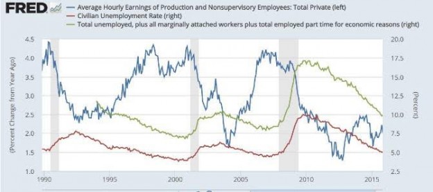
Pessimism continues unrelenting. I thought it would have shifted at least a little towards optimism by now. Yet we continue to hear a fairly strong disappointment with wage growth. What many point to is this chart is that current hourly wage growth near 2% is only half of that seen during full economic recoveries the past couple of economic cycles-see chart just below.
https://www.aei.org/publication/november-jobs-report-the-coke-zero-economy-continues/

This chart was in an article titled “November jobs report: The ‘Coke Zero Economy’ continues”. The article says with what one may take as sarcasm,
“But, but, but … few think this is a booming labor market, not with annual wage growth steady at just over 2% versus the 3-4% seen in strong recoveries and expansions. (Although good enough for the Fed to raise rates apparently.)”
This writer is not alone. The comment about low wage growth has been a focus of many. Every week someone expresses the view that the economy is awful because of low wage growth. This perception has been voiced so often that it forces one to pay attention.
The fact that in the current economy wage growth is only 2% vs. 4% in recent recoveries is correct. But, one cannot leave the analysis there. One must look at wage growth vs. inflation. It is Real Disposable Personal Income (after tax and after inflation) which matters the most. In the Real Disposable Personal Income chart just below, it should be clearly visible that Real Disposable Personal Income has soared to record highs and continues to trend higher. Then what is it that so many are missing in assessing current wage growth?
Real Disposable Personal Income

What all miss is that historical wage growth has always kept pace with inflation. Higher inflation has always produced higher wage growth and lower inflation has always produced lower wage growth. Employers cannot afford to not pay a decent wage because employees will go elsewhere. Wages have for the most part always kept pace with inflation and then a little bit more. This is what the chart of Average Hourly Wages, YoY Wage Growth vs. Inflationshows from 1977 to Present. Average Hourly Wages is shown as the BLUE LINE, Year-over-Year Wage Growth is shown as the BLACK LINE and Inflation is shown as the GRAY DASHED LINE. One can see that the rise and fall in Avg Hourly Wages tends to lag Inflation, but net/net employee wages exceed income over time as is shown by the rising Real Disposable Personal Income in the chart above.
Average Hourly Wages, YoY Wage Growth vs. Inflation

One cannot draw conclusions and make statements about Avg Hourly Wage Growth without comparison to inflation. When the correct comparison is made, one can understand the uptrend in Real Disposable Personal Income and why Retail and Food Service Sales are so strong. Individuals do indeed have more disposable income to spend!!
Retail and Food Service Sales

Low inflation has been causing considerable confusion in the analytical community. Inflation is often a factor in growth data which cannot be ignored. Inflation is low as US Government has slowed military spending with the withdrawals from Afghanistan and Iraq. If the fall in US Government spending and the impact on inflation is included in the analysis of current economic data, many who are pessimistic today would become far more optimistic.
Equity markets (SPY) would be higher if investors were more optimistic. Nonetheless, economic activity continues to expand.


Leave A Comment