Phase One began in January 2016, and slowed down from July until early October. (Charts in this commentary are courtesy Stockcharts.com, unless indicated).
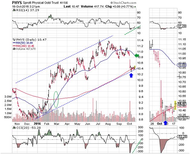
The first sign of a turnaround can be seen in this chart:

Featured is PHYS the Sprott Gold Trust. Price produced an Upside Reversal (blue arrow), on Oct. 7th. Since it happened at the bottom of the rising channel and at the 200 Day Moving Average, this was an important clue. Confirmation occurred on Oct. 18th, with price breaking out above recent congestion. (See the zoom chart at right). The supporting indicators have turned positive (green lines), and the 50DMA is in positive alignment to the 200DMA (green oval), while the latter is in firm uptrend. The first target is at the green arrow.
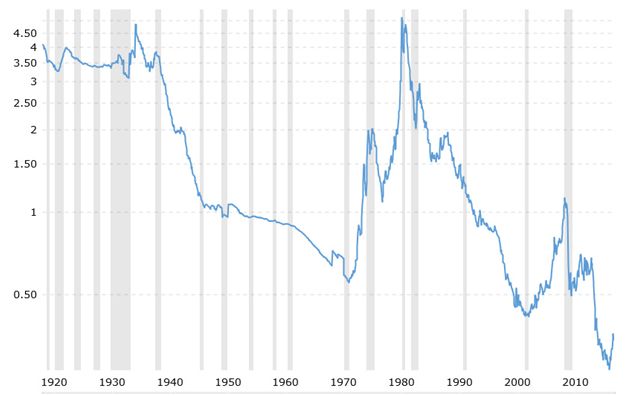
This chart (courtesy www.macrotrends.net) is one of our favorite long term charts and we feature it often. It shows the gold price in comparison to the US Monetary Base. This index shows important turnaround points for gold, as seen in the early 1970’s, 2001, 2009 and now in 2016. The amazing take-away from this chart is that gold is presently the cheapest it has been in at least 100 years! We may never see it this affordable again in our lifetime.
BATES, Larry: “The greatest shock of this decade is that more people are about to lose more money than at any time before in our history. And the second biggest shock will be the incredible amount of money just a relatively small group of people will make at exactly the same time.” (Author of ‘The New Economic Disorder’)
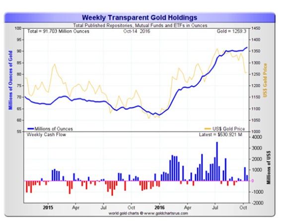
This chart courtesy Goldchartsrus.com shows investors are adding to ETFs and Trusts, in spite of lower gold prices during the past few months. This is positive divergence.
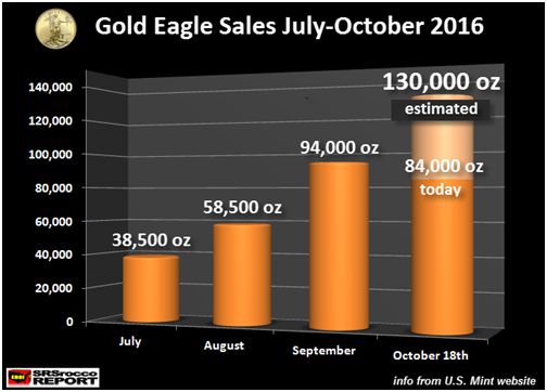
This chart courtesy SRSRoccoreport.com shows demand for US Gold Eagles is rising, despite a drop in the price of gold. It would appear that investors like a bargain.
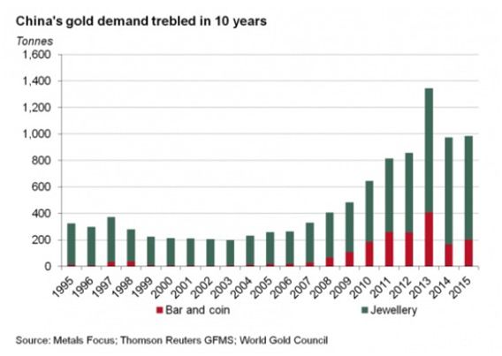
This chart courtesy sources listed shows demand for gold in China continues to grow. This demand provides a solid fundamental reason to own gold.



Leave A Comment