
Do you want to see something really ugly? Look no farther than the daily bar chart for the Dow Jones below.
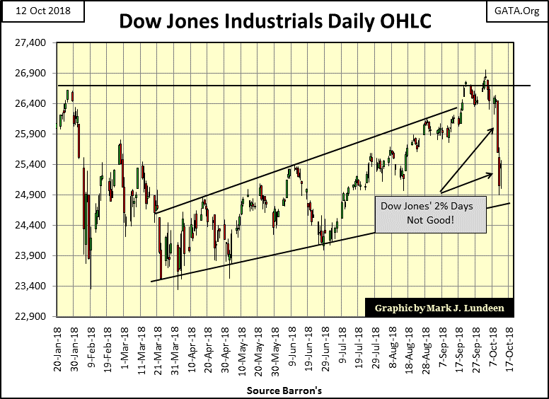
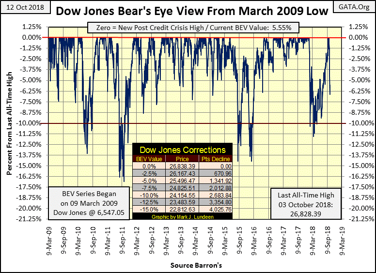
Yep, Mr. Bear was a bad bear this week. The Dow Jones saw two new all-time highs last week yet closed this week down 5.55% from them. This decline may not sound very dramatic, until you look at the Dow Jones’ BEV chart below. The Dow hasn’t been below its BEV -6.25% line since July; where it then took the bulls three months to make a few BEV Zeros (all-time highs). In the past week Mr. Bear gate crashed the festivities, clawing back over half the gains of the past three months with just a few swipes of his massive paws.
The worst day of the week was Wednesday; the Dow Jones closed down 4.58% in the BEV chart. Thursday was a bad day too, taking the Dow Jones 6.62% from the highs of last week, and then on Friday saw a nice 1.15% recovery. Not that a nice one day recovery in a market that sees two Dow Jones 2% days (days of extreme volatility) are necessarily bullish. See Mr. Bear’s report card below for the daily specifics.
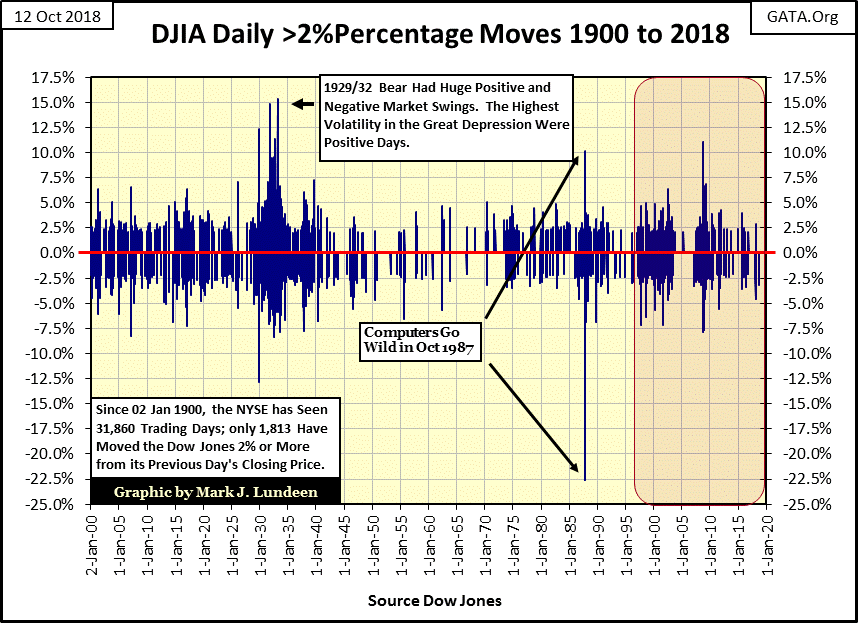
The best one-day recoveries in history occurred during the Great Crash of the early 1930’s, as seen below. In fact the largest daily moves during the Great Depression were advances, hard to believe but true.
Also note during the Dow Jones second deepest bear market, the Sub-Prime Mortgage bear market (October 2007- March 2009), there were no daily double-digit percentage declines, but on October 13, 2008 the Dow Jones saw a daily advance of 11.08%. “Market experts” everywhere cheered, but the bear market didn’t hit bottom until March 2009.
To have an appreciation of the frequency the Dow Jones sees days of extreme volatility, since January 2, 1900, almost 119 years, the NYSE has seen 32,155 trading sessions, of which the Dow Jones has moved more than (+/-) 2% from a previous day’s close in only 1,822 of them. So they are infrequent market events, and almost exclusively bear market events.
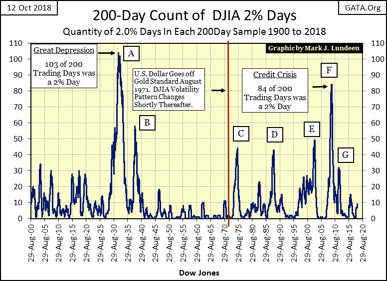
To render the above data in a more digestible format I’ve constructed what I call the 200 count below, where a 200 day running sample counts the number of Dow Jones 2% days (data from above chart). With the exception of G below, these spikes in extreme volatility were destructive market events for retail investors.
The Dow’s 200 count is currently building a new spike. So far it’s climbed to nine 2% days in a running 200 day sample. But if Mr. Bear is here to stay, it will rise to much higher levels before he is finished with his business on Wall Street. When it climbs above 20 I’ll label it H.
The NYSE this week also saw a day of extreme market breadth, aka a NYSE 70% Day. On Wednesday the NYSE had the following breadth statistics:
Advance: 342
Decline: 2,686
Unch: 53
TTL Shares Traded 3,081
Below I show my math for Wednesday’s NYSE 70% day
342-2686/3081= -76.08%
NYSE 70% days (Days of Extreme Market Breadth) are very rare market events. My data begins on 02 January 1926; since then the NYSE has seen 24,487 trading sessions, of which in only 388 has seen a 70% day as computed above. As with Dow Jones 2% days, NYSE 70% days are basically bear market events be they positive or negative 70% days.
The most interesting feature in the chart below are the clusters of 70% days that formed during the depressing 1930’s, and the current cluster that began in February 2008, and continues to this day.

Related Posts
 Growth Investing: Seasonality Favors Small Cap ETFs
 US Retail Sales: February 2016 Preview
 EC
China’s Growth – Miracle Or Mirage?
EC
China’s Growth – Miracle Or Mirage? Russell 2000 Passes Last Swing High As Semiconductors Breakout
 FX Week Ahead: RBA, BoC And ECB Meetings. GDP Reports
 Assuming Bitcoin plays nice, higher timeframe analysis points to $90 Solana (SOL) price
Leave A Comment