Back in 2010, the Fed justified its aggressive monetary policy “to promote a stronger pace of economic recovery and to help ensure that inflation, over time, is at levels consistent with its mandate” (full text). In effect, the Fed has been trying to increase inflation, operating at the macro level. But what does inflation mean at the micro level — specifically to your household?
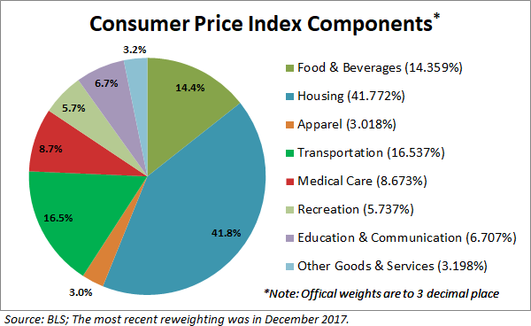
Let’s do some analysis of the Consumer Price Index, the best-known measure of inflation. The Bureau of Labor Statistics (BLS) divides all expenditures into eight categories and assigns a relative size to each. The pie chart below illustrates the components of the Consumer Price Index for Urban Consumers, the CPI-U, which we’ll refer to hereafter as the CPI.

The slices are listed in the order used by the BLS in their tables, not the relative size. The first three follow the traditional order of urgency: food, shelter, and clothing. Transportation comes before Medical Care, and Recreation precedes the lumped category of Education and Communication. Other Goods and Services refers to a bizarre grab-bag of odd fellows, including tobacco, cosmetics, financial services, and funeral expenses. For a complete breakdown and relative weights of all the subcategories of the eight categories, here is a useful link.
The chart below shows the cumulative percent change in price for each of the eight categories since 2000.

Not surprisingly, Medical Care has been the fastest growing category. At the opposite end, Apparel deflated since 2000 and has nearly returned to those levels in recent years. Another unique feature of Apparel is the obvious seasonal volatility of the contour.
Transportation is the other category with high volatility — much more dramatic and irregular than the seasonality of Apparel. Transportation includes a wide range of subcategories. The volatility is largely driven by the Motor Fuel subcategory. For a closer look at gasoline, see this chart in our weekly gasoline update.


Leave A Comment